Azure Horizon Design System
1. Overview & Creative North Star
Creative North Star: "The Digital Concierge" Azure Horizon is built on the philosophy of "Streamlined Hospitality." It moves away from the chaotic density of traditional administrative portals toward a calm, editorial experience. The system leverages high-contrast blue accents against a pristine architectural white canvas to guide students through their daily journey. By utilizing intentional whitespace and soft depth, Azure Horizon transforms functional utility into a premium lifestyle companion.
2. Colors
The palette is dominated by a vibrant "Electric Azure" primary color, used sparingly but intentionally to drive action.
- The "No-Line" Rule: Sectioning is achieved through color-blocking and surface shifts rather than 1px borders wherever possible. In instances where a boundary is critical, use
outline-variant(#e2e8f0) at 50% opacity. - Surface Hierarchy:
Base Background: #f6f7f8 (The "canvas")Primary Surface: #ffffff (Used for cards and interactive containers)Nesting: Usesurface-container-lowfor secondary background elements within a white card (e.g., info boxes or metadata tags).
- Glass & Gradient: Floating action buttons and the bottom attendance scanner should utilize a subtle 15% saturation gradient of the primary color with a 20px backdrop blur when overlaying content.
3. Typography
The system uses a pairing of Plus Jakarta Sans (Headlines) and Inter (Body/Labels) to create a modern, technical yet approachable feel.
Typography Scale:
- Display/Headline 1 (1.25rem / 20px): Bold, tight tracking (-0.02em). Used for section titles like "My Accommodation."
- Title (1.125rem / 18px): Semi-bold. Used for card headers and primary names.
- Body Large (1rem / 16px): Regular weight for primary functional text.
- Body Medium (0.875rem / 14px): Standard body copy and secondary buttons.
- Label Small (0.75rem / 12px): Secondary metadata and support text (e.g., "3rd Floor").
- Caption (10px): Ultra-small utility text for navigation labels and micro-stats.
4. Elevation & Depth
Azure Horizon rejects heavy drop shadows in favor of "Atmospheric Layering."
- Shadow-SM (0 1px 2px 0 rgba(0, 0, 0, 0.05)): Used for standard cards to create a slight lift from the
#f6f7f8background. - Shadow-LG (0 10px 15px -3px rgba(19, 127, 236, 0.3)): Reserved exclusively for the "Primary Floating Action" (e.g., Scan Attendance) to create a signature glow.
- Tonal Layering: Depth is primarily communicated by nesting a
surface_containerelement inside asurfacecard.
5. Components
- Buttons:
- Primary: Solid Azure with rounded-xl (0.75rem) corners.
- Secondary: 10% Opacity Azure background with Azure text (Ghost style).
- Cards: White background, 0.75rem border radius, subtle border (#e2e8f0).
- Quick Action Tiles: Square-leaning cards with center-aligned icons in tinted containers (Red-100 for grievances, Purple-100 for support).
- Navigation: Persistent bottom bar with active states indicated by the primary color and filled icon variants.
6. Do's and Don'ts
Do:
- Use the 10px typography for navigation labels to maximize vertical scan space.
- Apply
rounded-full(pill shape) to status indicators and avatars. - Use horizontal scrolling for roommate/person lists to keep the vertical layout clean.
Don't:
- Do not use black text; use
#0f172a(Slate-900) for better readability and a "softer" premium feel. - Do not use more than two primary buttons on a single viewport.
- Avoid using pure grey shadows; use a tiny hint of the brand blue in shadow values for a cohesive look.
7. UI Screens
| Screenshot | Screen Name |
|---|---|
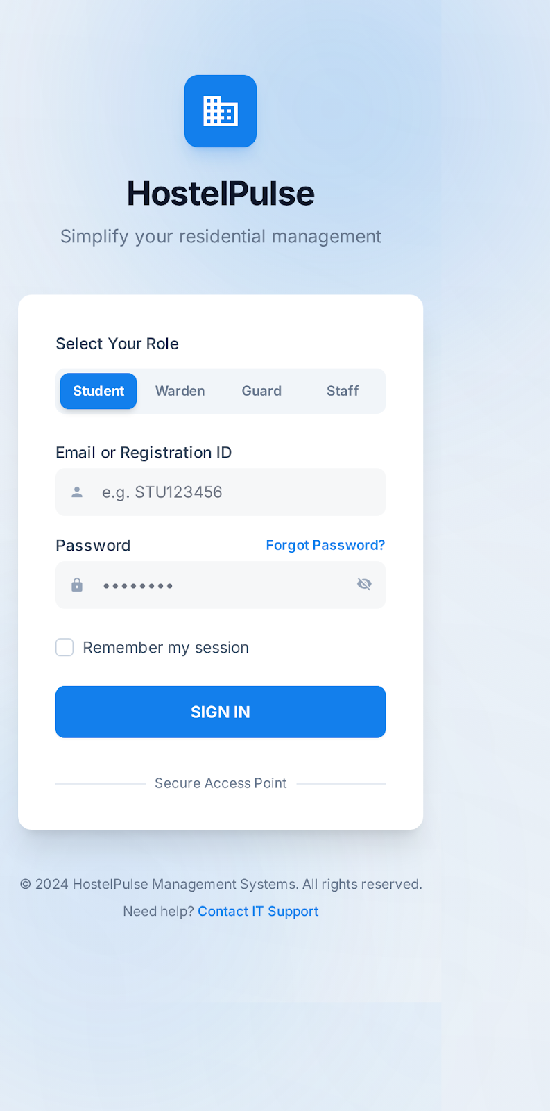 | Login Screen |
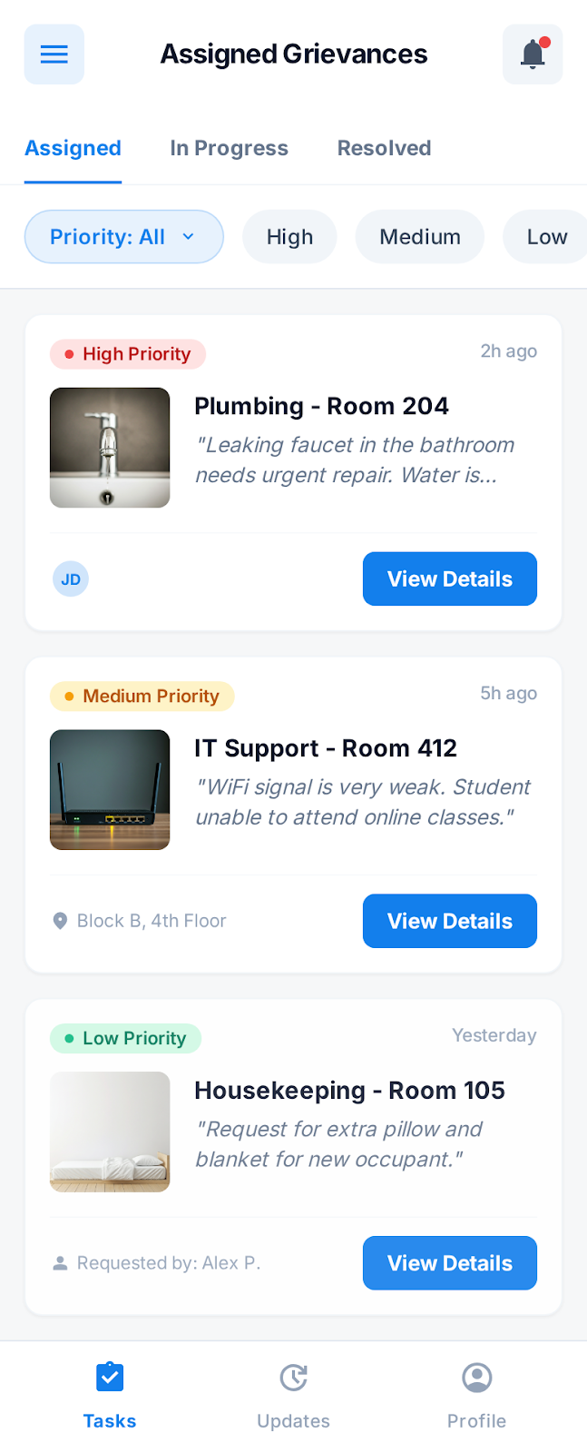 | Task List Home |
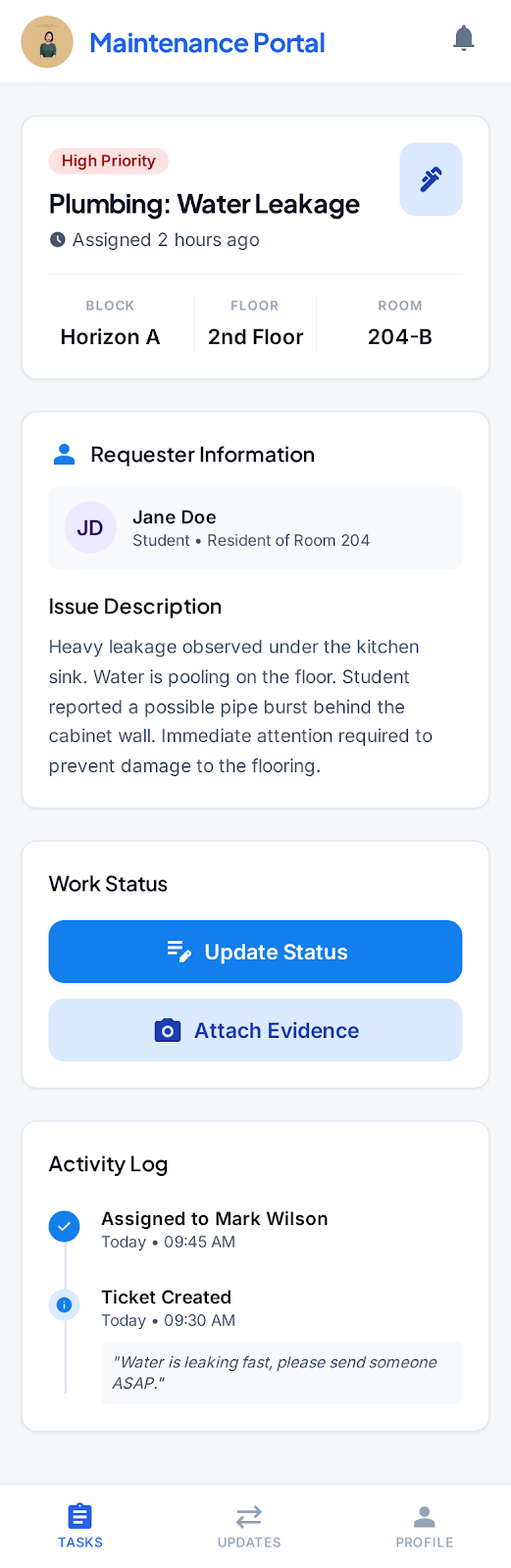 | Task Details |
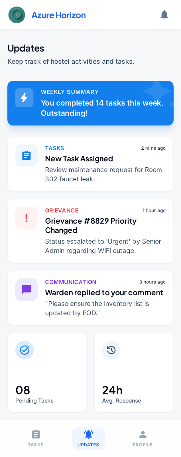 | Updates |
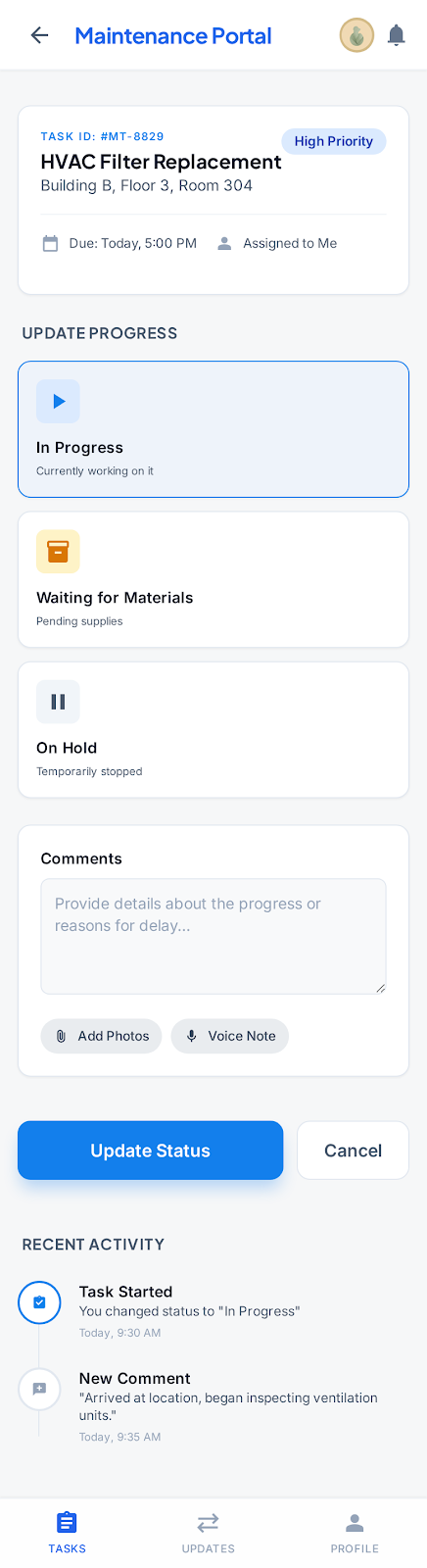 | Update Progress |
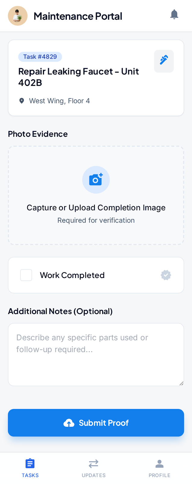 | Submit Completion Proof |
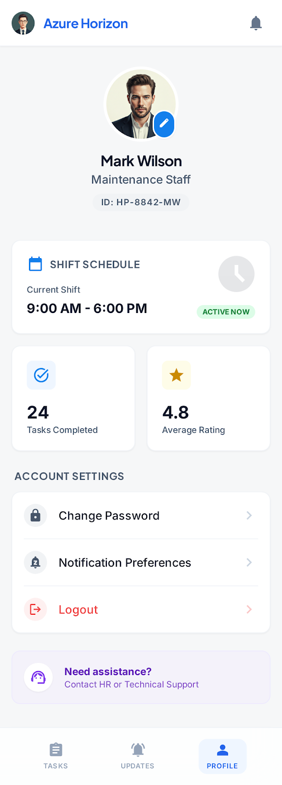 | Profile |