Design System Specification: The Guardian Authority
1. Overview & Creative North Star: "The Vigilant Monolith"
In the high-stakes world of security management, design must do more than just function—it must command authority and instill absolute trust. Our Creative North Star is The Vigilant Monolith. This concept rejects the cluttered, "dashboard-heavy" aesthetics of legacy enterprise software in favor of a clean, editorial layout that feels both indestructible and hyper-intelligent.
We break the "standard app" mold by utilizing Intentional Asymmetry. Important status indicators (like "On-Duty" status) should feel like bold, architectural statements rather than small icons. By leveraging high-contrast typography and vast, breathing white space, we ensure that a security guard in a high-pressure situation can parse critical information in a split second. This is utility-focused design elevated to a premium, professional standard.
2. Colors: Depth Without Borders
This system moves away from the "boxed" UI. We utilize a sophisticated blue-and-white palette to convey professional stability.
The "No-Line" Rule
Explicit Instruction: You are prohibited from using 1px solid borders for sectioning. Structural separation must be achieved through background shifts. For example, a surface-container-low (#f2f3ff) section sits directly on a surface (#faf8ff) background. The shift is subtle, but the eye perceives the change in elevation without the "visual noise" of a line.
Surface Hierarchy & Nesting
Treat the UI as a series of stacked, premium materials:
- Base Layer:
surface(#faf8ff) - Secondary Sectioning:
surface-container-low(#f2f3ff) - Actionable Cards:
surface-container-lowest(#ffffff) - High-Intensity Alerts:
surface-container-highest(#dae2fd)
The Glass & Gradient Rule
For the bottom navigation and floating action buttons, use Glassmorphism. Apply surface-container-lowest with a 85% opacity and a 20px backdrop-blur. This allows the map or list content to bleed through slightly, ensuring the interface feels integrated into the environment. Main CTAs (like "Clock In") should use a subtle linear gradient from primary (#00327d) to primary-container (#0047ab) to provide a "soulful" depth that a flat fill cannot match.
3. Typography: Editorial Authority
We pair Manrope (Display/Headline) for a modern, geometric authority with Inter (Body/Labels) for maximum legibility.
- Display (Manrope): Use
display-md(2.75rem) for critical numbers, such as "Hours Worked Today." It should feel massive and undeniable. - Headlines (Manrope):
headline-sm(1.5rem) serves as the primary anchor for screen titles like "Attendance History." - Title (Inter):
title-md(1.125rem) is used for card headings. Use afont-weight: 600to ensure high contrast against theon-surface-variant. - Body (Inter):
body-md(0.875rem) is the workhorse for all descriptions. - Labels (Inter):
label-sm(0.6875rem) withletter-spacing: 0.05remand uppercase transform should be used for metadata (e.g., "SHIFT START").
4. Elevation & Depth: Tonal Layering
Traditional shadows are often "muddy." We achieve depth through Tonal Layering.
- The Layering Principle: To lift a card, place a
surface-container-lowest(#ffffff) element on top of asurface-container(#eaedff) background. - Ambient Shadows: If a floating element requires a shadow (like a "Clock Out" button), use an extra-diffused shadow:
box-shadow: 0 12px 32px rgba(19, 27, 46, 0.06). Note that we use a tinted version ofon-surface(#131b2e) rather than pure black. - The Ghost Border Fallback: Only if accessibility contrast ratios fail, use a "Ghost Border":
outline-variant(#c3c6d5) at 15% opacity.
5. Components: Precision Primitives
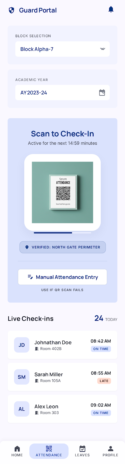
The Command Bottom Nav
The 4-tab navigation (Home, Attendance, Leaves, Profile) is the anchor.
- Active State: Use
on-primary-fixed-variant(#00419e) for the icon and aprimary-fixed(#dae2ff) pill-shaped background behind the icon. - Inactive State:
on-surface-variant(#434653). No labels are needed if iconography is distinct, thoughlabel-smis permitted for clarity.
Attendance Cards
- Forbid Dividers: Use
8(1.75rem) vertical spacing between list items instead of lines. - Visual Feedback: Use
tertiary(#651f00) for "Late" markers andprimary(#00327d) for "On Time." - Shape: Use
xl(0.75rem) roundedness for all cards to soften the "industrial" feel into a "premium" one.
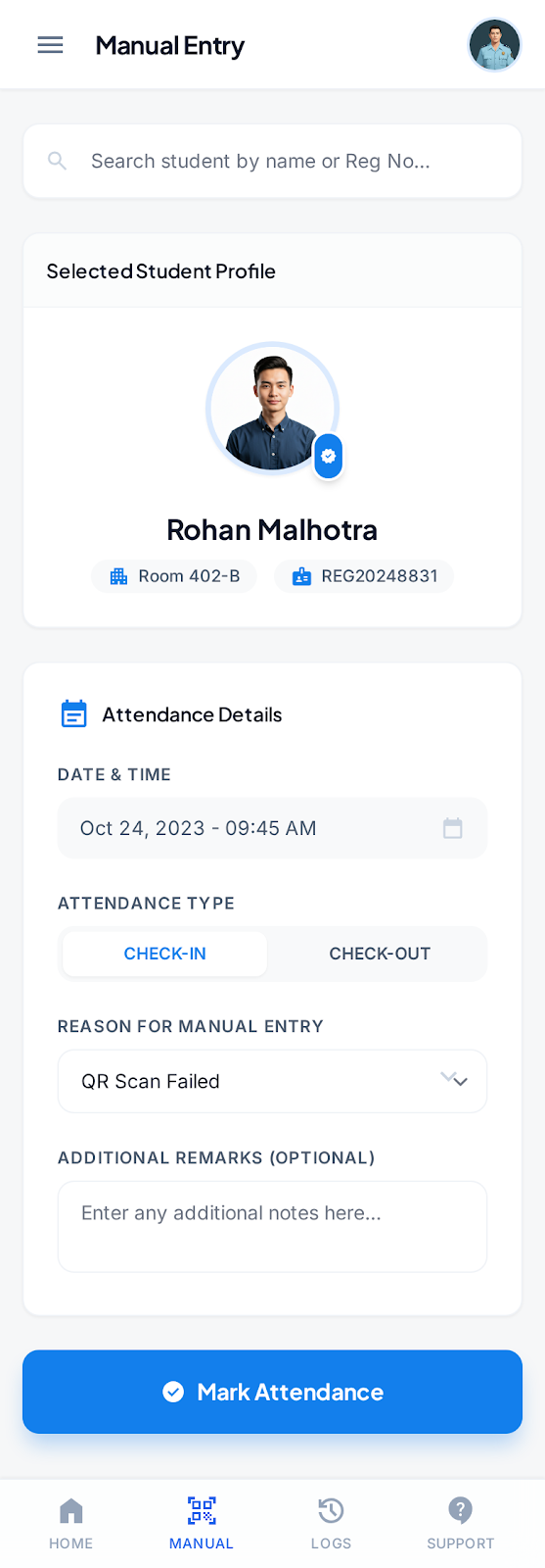
Action Buttons
- Primary: Gradient fill (
primarytoprimary-container), white text,lg(0.5rem) roundedness. - Secondary:
secondary-container(#d5e3fc) fill withon-secondary-container(#57657a) text. No border.
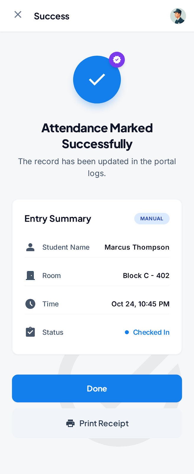
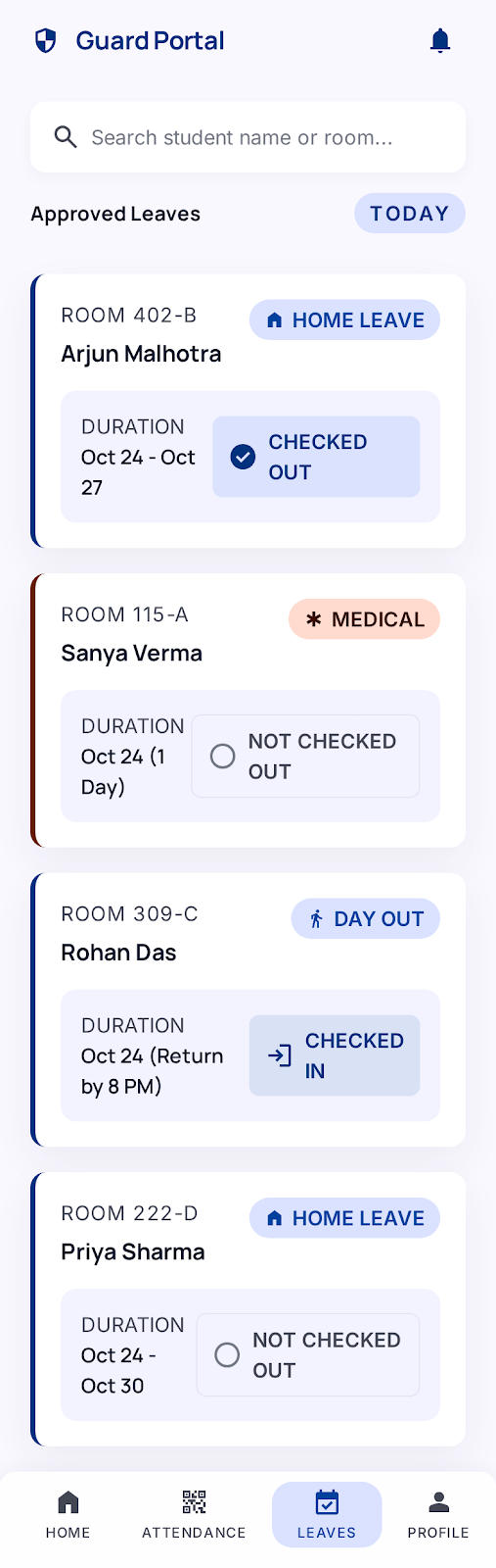
Status Chips
Use tertiary-fixed (#ffdbcf) with on-tertiary-fixed (#380d00) for high-priority leave requests (e.g., "Urgent"). Use primary-fixed (#dae2ff) for standard "Approved" statuses.
6. Do's and Don'ts
Do
- Do use
20(4.5rem) and24(5.5rem) spacing for top-level page margins to create a high-end, spacious feel. - Do use "Manrope" for all numerals. It has a modern, architectural quality that suits a security app.
- Do use
surface-bright(#faf8ff) for the main background to keep the app feeling "fresh" and "modern."
Don't
- Don't use 100% black. The darkest color should be
on-background(#131b2e). - Don't use standard
0.25rem(DEFAULT) rounding for everything; it looks "template-like." Lean intoxl(0.75rem) for containers andfullfor buttons. - Don't ever use a horizontal rule (
<hr>) or 1px border to separate list items. Use spacing or a subtle background toggle.
7. Signature Interaction: The "Monolith" Clock-In
When the user arrives at a site, the "Clock In" action shouldn't be a simple button. Use a surface-container-highest container that spans the width of the screen, utilizing display-sm typography. This creates a moment of high-intent "Command and Control" that reinforces the guard's professional responsibility.
8. UI Screens
| Screenshot | Screen Name |
|---|---|
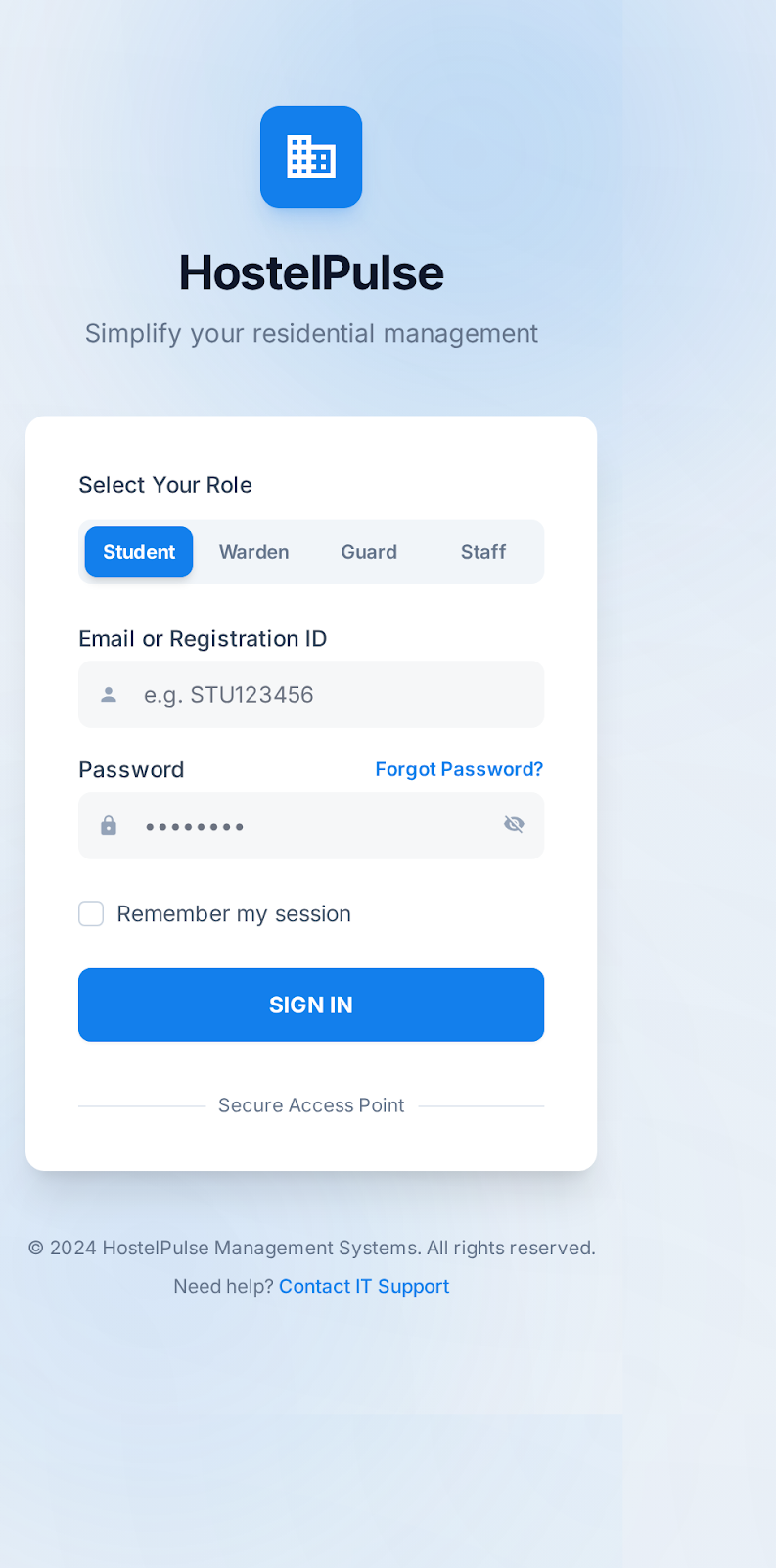 | Login Screen |
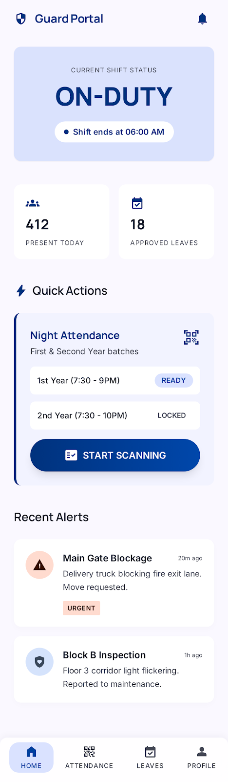 | Home |
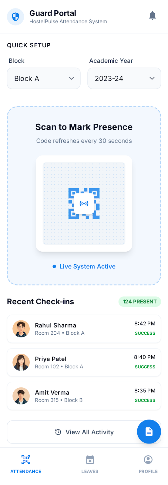 | Attendance Original |
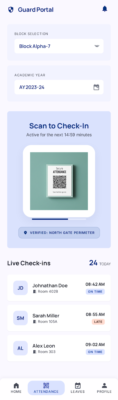 | Attendance Updated |
 | Attendance Tab With Manual Entry |
 | Manual Attendance |
 | Manual Attendance Success |
 | Leaves |
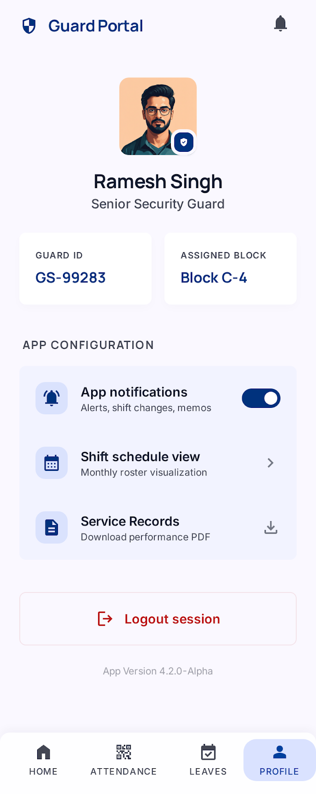 | Profile |